It has been a tough couple of months, making the stop motion/ real music video, making the digipak and advert, re-writing my song and doing the evaluation, so I am happy to announce on this post that I am finally finished.
A lot of work went into the stop motion video, including planning and research, of which was carried out on my blog, although a couple of changes to the storyline were made during the process of making the stop motion.
For the stop motion I had to draw every single picture, including backgrounds, characters, props etc in order to get a perfect and swift moving stop motion video and this of course was incredibly difficult to pull off. I had also had a couple of technical issues involving the camera at the start of the process, which actually meant that I had to re-start the project at least three times, which of course was a nuisance having taken and drawn so many pictures, just for the camera to not have saved them.
There was also a problem with the song, I felt that since so much work had gone into making the stop motion and that there wasn't a single part of it I wanted to re-edit, that I had to edit my song slightly in order for it to fit with the music video as the original song was only a couple seconds out. This meant that I had to record the track again and mix and produce it again, the downside this time is that one of my main condenser microphones had some how blown out which meant that I had to compromise with a weaker microphone.
For more detail about my work, please view the previous posts.
Thank you
Sunday, 10 February 2013
Wednesday, 23 January 2013
Camtasia video for Evaluation question 4.)
How did you use media technologies in the construction and research, planning and evaluation stages?
For this Camtasia evaluation answer there will be no talking but just the screen showing pictures of the different objects used throughout my A level media including a hint of the software's used and then in another video that will be posted on the same post will be a video with an over voice where I will talk about the software's I used and what I used them for.
Here is the video that shows off the two main software's that I used, I also use Imovie but only for the reality section and on my personal Mac so its much harder to get a video of that process.
Here is a video showing my editing process in further detail, using Final cut pro as the software.
Tuesday, 22 January 2013
How did you use media technologies in the construction and research, planning and evaluation stages?
Throughout my media A levels including AS level and A2 level, I have used a wide range of forms of media to create my projects including filming equipment, editing software, other softwares, blogs etc.
In my AS media we had to create an opening for a Thriller in which I partnered up with my friend 'Nick Field' to make it, we had taken shots in various locations including ground from Aldenham school, My house and Beevors house within Aldenham school. We had used a digital camera, tripod and SD card from school and my own personal video camera to take point of view shots and to show us walking in holding the personal camera as if someone was watching us. We used two other actors to play our friends in the thriller. For this we had only used one editing software and this was final cut pro, nothing else was used for the editing of this thriller and then we had updated our blogs regularly showing our progress step by step and our research of thriller movies, locations and opening scenes.
For my A2 media, I had decided to do something different and make a stop motion which meant many many hours, days, weeks and months in a single undisturbed room taking shots using a stills camera made by Sony which I had borrowed from the school and this was placed on a standard tripod. All in all I had taken a lot over five thousand shots for my music video and I made a reality scene in which I used a digital camera made by Panasonic and a tripod and a SD card. The filming for the reality scene took place at the actress' house. Then to edit this video I used Final cut pro for the stop motion part in which I had to cut every picture to a frame per picture and add it all in together and for the reality scene I used Imovie. For my Digpak I used InDesign to crop and size my desired pictures, place text on top of them and crop, size and place my many stop motion pictures around the borders of each inside page of my Digipak from page 1 to the back page (not including the front cover) then I used Photoshop for the album advert as well as InDesign because I had to change the colour of some images to then place on top of my advert for example the stars were originally black but I had to change them to orange and the background of the Itunes logo was orignally white which I had to change to black. I also had to use InDesign on the advert to add two additional black strips to the bottom and top of the front cover picture used for the advert in order for me to have room to place comments, ratings and information about the upcoming album and I used InDesign to move the word 'music' further to the right in the advert, just to have a slight bit of difference between the original front cover and the copy front cover for the advert.
Throughout my media A level including AS level and A2 level, I have been using blogger to update my progress throughout the course regularly in order to show my audience what I have been doing in terms of research, planning, drafts, ideas and final copies etc. The blog has helped me to share my research with the public and enable me to look back at my research to make new ideas or upgraded ideas to add to my coursework, for example if I ever want to look back at videos that inspired me or something along those lines, all I have to do is click on 'videos that inspired me' and then I can look at my research to help me get further ideas. The blog has helped me maintain the continuity through my coursework without losing track of what I have done. At the end of my blog e.g when all posts are finished and completed, I will upload my music video on a separate post to blogger as well as Youtube where I will hope to share my music successfully with the public.
What have you learned from your audience feedback?
My Questionnaire sparked a whole load of shocking answers to what audiences really wanted to see in new music videos, but while many answers were normal and expected, there were many that weren't expected.
I had the idea of making the stop motion video with a reality section from day 1 but I of course had doubts but after asking 50 people I know it seems that the majority of them wanted me to stick to my plan and make something different and unique to previous music videos.
After showing my video to many of my friends, I could see that the expression on their faces changed rapidly with shock and excitement because it worked so well and the experience of the music video is a memorable one. Some of my friends couldn't even prevent themselves from shouting out great remarks during the video, such as 'mate this is awesome' , 'Omg how have you done this?', 'this is something you'd expect to see at a university media course or something made in a professional studio, I can't believe my eyes'.
I will post a couple videos showing the reactions of my friends, some will be of them watching it and showing their reaction from the Imovie camera and some will be showing what they are watching and hearing their reaction on Camtasia.
How effective is the combination of your main product and ancillary texts?
Again I think my digipak had some 'real' elements to it when compared to other digipaks within the music industry but it also had some unique elements that I personally haven't seen before but may exist in other digipaks.
My design of digipak is based around many different genres of music, the pictures of me playing on my guitar on the inside of the digipak come from the pictures seen inside digipaks from the singer/songwriter genre e.g Ed Sheeran, Ben Howard etc. The front cover where I look emotional standing there with a massive heart in my hand comes from digipaks of the RnB genre because the emotion shown by RnB artists of the front covers, gave me that inspiration to be able to look sad, e.g Beyonce, Ne-yo etc. Then the clothes I was wearing enabling me to have a certain swagger came from the inspiration from Pop, Rap and Club genre digipaks e.g Chris Brown, Drake and David Guetta and the writing font on the dark background came from the inspiration of the cool looking fonts and colours from digipaks of the Rap genre e.g Jay-Z. These were all my inspirations from various Genres and artists that encouraged me to put these elements in my own digipak.
But I also had my own ideas too, which included the change of eyes in the back from the front because as you can see in the front cover my eyes are open symbolising the emotion and the fact that its the start of the album/digipak, but then in the back cover my eyes are closed showing my pain and the fact that the album is effectively closed because at that point it is the end. I also had the idea of adding pictures from my stop motion around the borders of each page starting from page one (the page after the front cover) all the way to the back cover, this was so readers of my digipak could enjoy a fun, mini spectacle on each page almost like a 'where's Wally' scene, which I thought would look cool and effective, but there's also a difference on each page apart from the pictures themselves being different but the order on each side of each page was different apart from the first where there were four pictures per side but that changes in every page because I wanted to have a bit more uniqueness rather be in order constantly throughout.
For my advert I decided to use the same front cover from my digipak but with one slight change, I moved the word 'music' slightly more to the right in the advert cover just so there would be a little bit of difference between the pictures. I then extended the top and bottom of the picture by adding two black strips in which I placed the text on. On the top strip, there was a comment and rating from well known 'MTV' which would show everyone how good my album really is, five stars. Then on the bottom strip I put that it is my debut album and that it would be released onto Itunes at a certain date. I decided to keep the font and colour the same for the extra information because I thought it would look best and I didn't want to have to big a contrast between colours.
To make my digipak and advert I used the 'Adobe InDesign' software which enabled me to crop and size my own pictures in the border lines, add the perfect text with the perfect colour fill and then it also enabled me to crop and size my stop motion pictures into various sizes to then dot around the border of each page of my Digipak as mentioned above. I also used 'Photoshop' for the advert in order to change the colour of the stars to orange which were originally black, which I got off Google images and to change the colour of the Itunes logo background to black which was originally white.
My digipak corresponds to my music video in the way that the dark background colour of my front cover contrasts well with the light background of the first two minutes of my music video. Then the clothes and the heart represents the clothes that I am wearing in the reality scene and the heart represents the heart from the reality scene that I give my ex. The title of my digipak 'Watching life through music' corresponds to my music video because the animation is showing my life during which my track is played, so effectively it symbolises myself watching my life through my music and then every picture of me performing inside the digipak shows the emotion and depth in my music which represents the power and emotion of my music video. The pictures of me performing in my digipak also reflect the style of music and the genre of my track which is the singer/songwriter genre and this is because most singer/songwriter genre digipaks and albums show the artist performing or singing.
In what ways does your media product use, develop or challenge forms and conventions of real media products?
The similarities between a 'real' music video and my own music video are actually very slim, as I had set out to creating something completely different and unique. In most music videos within the Singer/Songwriter genre of music on MTV, youtube, vevo etc you expect to see various shots of the artist playing/performing or long shots of where they are or their favourite places, but for my music video I had chosen to make an animation which in turn fits my album title perfectly, 'Watching life through music' as you are effectively watching my life through an animation whilst listening to the song, which I think was a very clever idea of mine.
Although my video is very different from the average music video, I have taken elements from previous music videos that I had seen in order to create newer ideas, like upgraded versions of the previous ideas if you will. A great example of a music video that inspired me was 'take on me' by 'A-ha', as it had a constant switch between reality and animation and I thought I would make my music video so that two minutes or just over would be based on the animation and the remaining time for the end will be based on a reality section, but again I did something different here, I had a transition between animation to reality, by making the first real part slightly blurred and muffled so that it would seem like its still partially based in an animated set.
Also something different about my music video is that the song had to fit with the video, but usually the video has to fit in time with the track, but I simply thought that there is always room for improvement or change with the song and not so much with the video because once the video is done it is very hard to edit to change significantly and so after completing the video I had to rearrange the track to fit with the video.
In some ways, I suppose my video could be seen as a normal music video because of the ending in the reality scene, where I have a certain pop star swagger about me and my clothing has a certain 'fly' sense to it, but I personally still wouldn't call it a standard music video, more my own unique creation.
My Evaluation
For my evaluation I am planning on writing out the answers to the questions provided by the examination board, then on top of that making a video where I explain my reason for the answers and where you can see the artist (me) in full and then I will make Camtasia videos showing the different programmes and softwares I used to make my video, digipak and advert.
What I used to make my digipak and advert
To make my digipak and advert I used 'Adobe In Design' to place the texts on top of the pictures and to crop, size and place the stop motion pictures around the borders and for my advert I used 'Photoshop' to add an orange colour to the stars which were originally black and then to colour in the background of the Itunes logo which was originally white, but I left the main picture of me untouched because I wanted the outlining effect from the dark background.
What my album advert represents
For my album advert, I used the same picture that I used for my front cover but I extended the top and bottom of the picture by using two black strips in which I placed my text. On top was my rating and comment from MTV saying 'He's going to be a star, his records are gonna fly off the shelves', which I thought was a nice touch and then I added 5 stars to this comment as well, showing the audience how good my album is. Then on the bottom strip I put that this is my debut album and when and where it is released. Another change is that I moved the word 'Music' in my main picture a little bit more to the right in the advert, just to add a little bit of difference to the picture which I thought was necessary.
What my back page of my digipak represents
The picture on my back page is more or less the same, showing me giving my heart whilst having swagger with the same clothes and everything, but the slight change of the back picture to the front is the eyes, in the front my eyes are open but in the back they are closed this was to show the emotion in me whilst making the expression of giving my heart to my ex. On top of this picture is my track list, all of which are my own songs, none of those names have been made up and then this time the border of the page represents the middle image of the heart, which I thought would be a nice effect to the end of the digipak.
What my fourth page of my digipak represents
The fourth page is about my music video and what it includes in the video and again the writing for this is placed over a picture of me playing again and again the plant in the bottom left corner represents 'life', as in the life that can be seen through my music. There are borders around the page again just for fun viewing.
What my third page of my digipak represents
My third page is to explain what the borders are and what they are for, explaining that who ever is looking at the digipak can follow the pictures round as each picture changes slightly, so the writing is placed over a picture of me standing with my guitar and the plant shown in the bottom left corner of the picture is there to represent 'life' as in the life seen through my music, then as in the other pages the borders have the stop motion pictures.
What my second page of my digipak represents
My second page is about my life so far and the struggles I go through to get to where I am now which again is placed over a picture of me playing my guitar from behind and again around the borders are the pictures from my stop motion.
What my first page of my digipak represents
My first page of my digipak is my lyrics page for my song 'I remember' which is placed over a picture of me playing my guitar with my head tilted down showing how I am lost in my music. I think the lighter dark blue of my guitar stands out and suits the dark blue background very well. I have placed various pictures from my stop motion all the way around the border of pages one, two, three, four and the back page and I have purposely put an uneven number of pictures on every side of every page which you can especially notice on the back page.
What my front cover represents
For my front cover I used a dark blue background in which I thought would make me stand out and with the right lighting outline my shape within the dark background. I am then holding the massive heart as it resembles my music video where I give my ex my heart for another chance literally. But I also keep a sense of swagger within the picture as I am wearing my snapback and hoodie, along with an earring that can just about be made out in the picture. I then chose my favourite font for the title and chose orange because I love the colour orange, it stands out well in blue and there's a distinct clash in colour between orange and red which I personally think that the clash works well and I chose that title 'Watching life through music' because I do watch my past experiences and my present life through the music I write and sing and it shows the power and emotion demonstrated in my music.
Letter of consent from actress
Here is a picture of the letter of consent signed by the actress used in the live scene:
Here is a picture of the letter of permission for use of land signed by the home owner who is also the actress:
Here is a picture of the letter of permission for use of land signed by the home owner who is also the actress:


Sunday, 20 January 2013
Album adverts that didn't inspire me
The album adverts that didn't inspire me would have to be from the Heavy Metal and Rock genres because I didn't like the layout and colours of them, the rap album adverts were quite good in colour and format I think and so were the Club album adverts, Pop adverts and RnB adverts, those ones I just mentioned all had a similar style to the singer/songwriter ones, but the Heavy Metal and Rock ones most certainly did not.
Album adverts that inspired me
The album adverts that inspired me to have the idea for my album advert would have to be the adverts from the Singer/Songwriter genre as obviously my style of music being in that genre then obviously my album advert would be suited to that genre as well.
Ben Howard's album advert especially as he has just extended the album from each side to then add further writing about his album and that has given me the idea to do the same in terms of extending the album.
Ben Howard's album advert especially as he has just extended the album from each side to then add further writing about his album and that has given me the idea to do the same in terms of extending the album.
My album advert idea
For my album advert I am thinking of just showing the album cover and then write something along the lines of 'My debut album released (on any date, need to think of one) and then where to buy' all in the same font and colour of the writing for my title of my album cover as I think it'll look best, then I will add a couple of ratings and stars at the top hopefully it'll look good.
Rock album adverts

Club album adverts


Heavy Metal album adverts

Singer/Songwriter album adverts


Saturday, 19 January 2013
RnB album adverts


Rap album adverts


Pop album adverts
Album adverts are usually very to the front cover of the actually albums because the adverts are usually written on the same picture used for the album cover.
 This is JLS's album advert where you can see they have used their album picture and then they have added a white stripe at the bottom with writing in black showing when the album is in stores.
 This is P!ink's album advert which again shows the main album picture from her album 'funhouse' and this just has a big white font added on top saying that it is out on october 24, the white works very well considering the background is almost white, its like a beige colour but the contrast between the pinkish red and the white font works well.
 This is Ellie Goulding's album advert for her album 'lights' which again the album cover is used and then the black background is extended downwards and writing in a small white print is added for the actual advert part, which is actually incredibly hard to read but by looking at the stars I can be sure that they are ratings from different sources e.g newspapers, magazines, Itunes, internet sources etc.
Friday, 18 January 2013
My second Digipak idea
I just had another idea for my Digipak and that is to have the 4 information pages with borders and not just any normal borders, but borders showing different scenes from my stop motion and just incase no one notices it, I would put a message on one of the information pages saying that pictures from my stop motion music video are around the pages on the border as if they are like a 'where's Wally' spectacle.
I then had a great idea of putting the border on the back cover as well, but the back cover with pictures of hearts which would reflect the picture of me with the heart. My plan is to arrange the pictures so that there aren't any mirrored images and that the borders all follow an order rather than a pattern, simply because I'm trying to be different and unique.
I then had a great idea of putting the border on the back cover as well, but the back cover with pictures of hearts which would reflect the picture of me with the heart. My plan is to arrange the pictures so that there aren't any mirrored images and that the borders all follow an order rather than a pattern, simply because I'm trying to be different and unique.
My Digipak idea
The idea I had for my Digipak was to have the front cover showing me holding a heart of some sort in my arms and looking sad into the camera whilst looking 'swag'. Then for the font of the front cover I was thinking of having a fancy italic sort of writing in orange, as orange is my second favourite colour and I didn't want to have red twice within the same part. Also I have decided to call my album 'Watching life through music' because that is what I do, I reflect on my life and my past through my music and it mainly came from the name of one of my other songs called 'Watching life through a window', so I changed the 'a window' part to 'music' as I thought it was more appropriate with the music video, the other reason for that name was that the video is of the present me drawing and seeing his life before him whilst the music plays in the background, so effectively the present me in my video was watching life through music.
I also had the idea of continuing the orange writing and same fancy italic font throughout the digipak and I was planning on having 4 pages of information, each containing a picture of me performing with my guitar in different poses, which I thought would look quite cool.
For the back cover of my album I was planning on having a very similar picture to the front cover picture, the only real noticeable difference would be my eyes, having them open in the front and closed in the back to cause a really nice effect of continuity within the digipak.
Digipaks that didn't inspire me
The digipaks that didn't inspire me were the Heavy Metal ones especially because of their Satanic nature and horrible mixture of 'hardcore' colours, I thought they were just awful and of course represented evil things and creatures, which I would never want to have on my digipak.
I found the RnB albums to be very powerful and emotional, but the male ones were showing the toned bodies of the male artists on the front cover and that would've definitely not suited me or there were the ones of the male artists in smart clothing e.g suits, but I thought obviously that would make me look smart, but my song is more of a casual love song so it would've looked a little bit out of place.
The Rock albums were of all the members of the bands shown in various different ways and I just thought this wouldn't suit me because i'm a solo artist and not a band member of any sort.
I felt that some of the Pop albums suited me with their 'swagger' but the genre that suited me perfectly had to be the singer/songwriter genre because with those albums there was a sense of freedom in which anything could be shown for the front cover, any thing could be written in the digipaks and the fonts and colours of the fonts could be anything at all that is suited to the artist.
Digipaks that inspired me
After looking at many different digipaks, front covers and back covers of various albums from various genres, I have come to the conclusion that I myself as an artist am most suited to the singer/songwriter genre and so therefore my album digipak should be of me, or something about me or a place I love.
The albums that inspired me were Ed Sheeran's, Jack Johnson's, Jason Mraz's and Ben Howard's albums simply because they each had something so simple in them all, Ed Sheeran's album was just of his face and with a background that blended in with his hair, which I personally think was very clever.
Jack Johnson's album was of him sitting on a stool, playing his guitar and singing, which is just so simple but effective, although he had another album showing an animated tree and a path from the tree to the back cover which was very clever.
Jason Mraz's album was also very simple showing him perform as well in the bright lights coming from a dark background and he had another one showing a cartoon drawing of him on the front, which I personally thought related to me exceptionally well, considering I had created a stop motion video for my music video, so the thought of making my digipak using pictures from my stop motion had come into mind.
Finally Ben Howard's album was very inspirational as well, showing a place he loved greatly, a river or lake or even sea of some sort possibly in Devon and it showed him diving into it. I thought it was a very good picture and made me think of what I could do.
So after looking at all these inspirational Albums I was stuck between the decision of putting a picture of me performing, or a stop motion picture I had used for the picture or a place I love for the front cover, but then I also looked over the Pop albums which were also very inspirational, showing the male artists looking 'fly' with their 'swag'.
Back covers of Rock albums


Rock Digipaks and front covers
Rock digipaks and front covers are very similar to heavy metals e.g showing the band in a sort of hardcore fashion with great colours behind them, or showing the band performing with a great atmosphere, they are very similar to heavy metal album covers apart from most aren't Satanic.
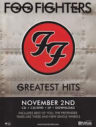
 This is Foo Fighter's album cover which is very interesting because obviously its a plain background in which a mixture of faces of the members of the band are shown in various colours mixed in together in the middle, and Dave Grohl's face can be seen a number of times, maybe to indicate that he's the main singer/ member of the band. But this lay out is very impressive considering the faces and the font for the band name and title works very well and contrasts in colour and the title is in fact brilliant as it corresponds with the main picture, 'wasting light', even though it shows the band in many different lights.
 Again this is a very impressive album cover from Kasabian, showing the main band member singing in different rotations throughout the picture which works very well as the cartoon version of him blends in with the black background as he has black hair, then there is a white part in the middle where the band name and title are written in black and red.
 This is The Strokes album cover which is definitely a contrast from the other two album covers I have analysed simply because this one has a white background, not a black one and each band member is allocated their own slot on the album then their band name is displayed in a very cool font in red and black.
Back covers of Club albums


Club Digipaks and front covers
Club music can include dance, dubstep, drum n bass and trance music, so the general club album usually show the artist/s looking cool and 'fly' in a background that stands out or in a cool place.
Most usually have brighter shaded colours but not too bright and not too dark like in heavy metal.
 This is Modestep's front cover, they are a dubstep group. As you can see the 'O' in 'Modestep' is changed to their yellow symbol which blends in quite well with the standard concrete floor and reflects the symbol that is also shown on the walls, then it shows each member from the group simply sitting against the wall in their own clothes.
 This is David Guetta's album which shows him leaning against a bright red background wall whilst on his toes and his shadow is left in the picture, then his name is shown in a really slick font in white and capital letters, this is a very cool album cover.
 Here is Netsky's album showing him in his fly clothes and on his toes again standing on a concrete surface with a cloudy background which makes him stand out more, then his name is spelt in italic capital letters in white coming out where the lighter part of the cloud is.
Most usually have brighter shaded colours but not too bright and not too dark like in heavy metal.
Back covers of Heavy Metal albums


Here is the back of a Metallica album, where again you can see that there are mainly colours of blood red and black in which this particular album shows a monster type creature with a fist on a rope around its neck, this is still very Satanic.
Heavy Metal Digipaks and front covers
Heavy Metal Digipaks usually have more darker colours e.g red or black representing Satan and then they show the band in full fury or they have pictures of 'hardcore' and scary things. Most of the scary images used for front covers are animated or cartoons.
 This is 'Jump in the fire' by Metallica which as you can see has a mixture of red, black and orange, whilst showing a monster like creature, possibly Satan coming out of the fire and the title says it all really.
 This is and Iron Maiden front cover where again there is fire and animated images of a weird ghost, witch monster thing and again the devil Satan.
Thursday, 17 January 2013
Back covers of Singer/Songwriter albums


Singer/Songwriter Digipaks and front covers
Usually Singer/Songwriter Digipaks and front covers show the artist in a simple fashion doing the thing they love doing, playing there instruments or in their favourite place or just a simple picture of their favourite place, this is why these artists are so different and much more unique when compared to 'Pop' artists.
 First up is an album cover of Jason Mraz, its very simple showing lights on him as he performs to what we can only imagine to be a vast audience whilst he sings and plays guitar, and not even a fancy guitar but a simple one. The font is also very simple but effective and suits his style, I think that this album cover is very simple but effective with the use of just black and white and then adding a little bit of colour to catch the audiences eyes, so that they read the 'limited edition' sign.
 The second example the album cover of Jack Johnson, which again is very simple as in colours where he mainly uses a greyish blue with a hint of bright red bordering on dark in which he's sitting on a stool dressed completely in black playing his guitar and singing into what looks like a condenser microphone. The font is very fancy in a sense and an unusual one but it suits the simplicity of this particular album cover.
 The third example is of Ben Howard's album cover showing what seems to be himself plunging deep into water in which I only assume is in Devon considering that he comes from Devon and once said it was his favourite place in the whole world. This is very powerful because of the different shades of blue and the positioning of the light and his body within the water.
 The final example is of Ed Sheeran's album cover, which again is another very simple album cover just showing his face and his orange hair which blends in with the background which is in his hair colour of orange too.
 Here is a Jack Johnson digipak which is infact very clever in its yellow background, the front cover shows Jack standing next to a tree in which the back cover continues the pathway and shows another tree forming and towering over the main front tree but then if you open the CD case up you get a yellow CD with a branch of leaves on it, which is very simple but effective again.
Back covers of RnB albums


RnB Digipaks and front covers
RnB Digipaks are very similar to Pop digipaks, the female artists still try to look sexually appealing, but in most female RnB artists front covers they are more covered up and look much more powerful and more emotion is shown by them. But on the male artists front covers you tend to see a lot more skin as they shown off their toned bodies or they are very smart looking in suits.
 In this example we have 'u got it bad' by Usher, in this one he has a light background in which he shows off his toned body and uses the light to make a glistening effect on his body which is very attractive to female audiences.
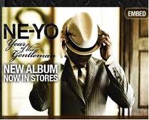
 This example is of a Ne-yo front cover which is based around a white kind of background showing Ne-yo all smart in a suit and hat from the view through what seems to be a railing as if someones looking at him put on his hat or dance either way, it is hard to tell what he is really doing.
 In this example we see Beyonce standing out of a light green background, where she is looking very prominent and powerful but beautiful at the same time in a black dress which covers her up. This shows that female artists can look beautiful without having to take all of their clothes off.
 Here is a Rihanna digipak which shows Rihanna is a mist of roses and petals which match her rosey red coloured hair, this particular digipak only shows pictures from what we can see but I think the part next to the CD's with the white outline is the booklet filled with information as that's what it looks like and again Rihanna is shown with clothes on showing her emotions rather than her usual self, looking sexy to attract male audiences.

Subscribe to:
Comments (Atom)