Most Digipaks within the Pop genre show off the artist or have cool images on them, the front and back covers of the albums usually show off a sexually appealing side of the artists. Female artists are usually laying down on something soft looking or squatting down, showing off a lot of leg.
Whereas male artists are usually just in the picture looking cool or 'fly' with a lot of 'swag', usually in darker coloured clothing, not bright bright colours like pink and yellow.
This is an example of a male album cover which shows Justin Bieber in a dark coloured t-shirt showing him trying to look cool in front of a beach scenery, there's a lot of shadow around him and he is trying to show a lot of emotion staring away from the camera in 'his world'. The colours on this album cover are incredibly limited and in my opinion the font and font colour doesn't really work.

This is an example of a female album cover which shows Pixie lott in a very sexy position, sitting backwards on the chair with her long legs equally placed on either side the chair, I think this is a great album cover, but I would think that since I am a man and this is intended to be appealing to men and I think the colours work really well as the silver chair matches the background and she is wearing a light blue top along with dark blue jeans and the black and white writing makes the contrast between colours which is really quite nice, I also think it is very clever how they have left the shadow in, as the shadow is in proportionate with her and almost mirrors her shape.


Here are two examples of Carly Rae Jepsen's album covers, both with what look likes the same theme, so the question has to be is this her trademark? Well the answer to that is I'm not sure but anyway she is squatting in quite a sexy fashion in high heels, showing a lot of leg and posing trying to look sexy and its working. But the reason I put up two of hers is because she's wearing similar clothes in both, similar high heels just different colour, one yellow and one red/pink then again a lot of leg showing in both along with a flowing top on each of the pictures just in a different colour again. Then it seems like she swaps colour in the second picture with the colour of the font as in the first her name is in pink and the title is in blue, whereas in the second one, her name is in blue but her title is a lot smaller in pink and I'm not complaining about it really, I am simply pointing it out that there is a coincidence between two of her albums.

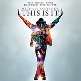
This is the late Michael Jackson's final album called 'This is it' which I think is very well done, as he was considered as the King of Pop, the colours work brilliantly, which aren't actually colours, more different scenes of him performing mixed up into one to form his shape, which is very clever and stands out especially well in a blueish mist.
This is an example of a simple digipak from Justin Biebers album 'Believe', where you can see there's not a lot in this one, just the CD, the front cover and the back cover, maybe there's a little section inside but we cannot see this.
This is Katy Perry's Digipak from her album 'Teenage dream', which looks very childish and teenage like because of the colours used and the spiral like second CD along with the gigantic cake pictures within her Digipak but then her front and back cover as shown on the picture above are incredibly sexual as she is lying on a fluffy pink cloud practically naked apart from her bosom being covered up by the cloud and her hands and her bottom being covered up too, but only just covered up.


No comments:
Post a Comment